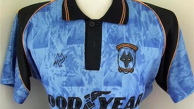
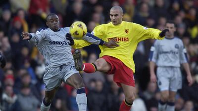
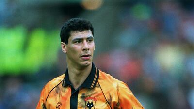
Premier League clubs are back in training after the coronavirus-enforced lockdown.
Before the season kicks back into gear on June 17, we will continue our look back on 30 years of football kits from the current 20 top-flight English clubs.
There have been some stunning works of wonder over the years ... as well as truly heinous crimes committed in the name of sporting fashion.
Next in our series is Wolverhampton Wanderers, so take a trip down memory lane in the photo gallery above and click on the arrows, or simply swipe to look at the next image.
Ferrari 12Cilindri specs
Engine: naturally aspirated 6.5-liter V12
Power: 819hp
Torque: 678Nm at 7,250rpm
Price: From Dh1,700,000
Available: Now
While you're here
Mustafa Alrawi: To get the 'jab' done, there must be patience and empathy
Damien McElroy: Anti-science attitudes in America are proving lethal
Editorial: What makes the UAE such a good place to test vaccines?
Editorial: The fight against Covid-19 should be guided by science
F1 The Movie
Starring: Brad Pitt, Damson Idris, Kerry Condon, Javier Bardem
Director: Joseph Kosinski
Rating: 4/5
Benefits of first-time home buyers' scheme
- Priority access to new homes from participating developers
- Discounts on sales price of off-plan units
- Flexible payment plans from developers
- Mortgages with better interest rates, faster approval times and reduced fees
- DLD registration fee can be paid through banks or credit cards at zero interest rates
Read more about the coronavirus
Company%C2%A0profile
'Moonshot'
Director: Chris Winterbauer
Stars: Lana Condor and Cole Sprouse
Rating: 3/5
Zodi%20%26%20Tehu%3A%20Princes%20Of%20The%20Desert
57%20Seconds
The biog
Name: Marie Byrne
Nationality: Irish
Favourite film: The Shawshank Redemption
Book: Seagull by Jonathan Livingston
Life lesson: A person is not old until regret takes the place of their dreams
Killing of Qassem Suleimani
National Editorial: Suleimani has been killed, now we must de-escalate
Jack Moore: Why the assassination is such a monumental gamble
Matthew Levitt: Iran retains its ability to launch terror attacks
Damien McElroy: A CEO tasked with spreading Iran's influence
Hussein Ibish: Trump's order on solid constitutional ground
Simon Waldman: Cautious Israel keeping a low profile
Persuasion
On Women's Day
Dr Nawal Al-Hosany: Why more women should be on the frontlines of climate action
Shelina Janmohamed: Why shouldn't a spouse be compensated fairly for housework?
Justin Thomas: Challenge the notion that 'men are from Mars, women are from Venus'
The National Editorial: Is there much to celebrate on International Women's Day 2021?
The specs
- Engine: 3.9-litre twin-turbo V8
- Power: 640hp
- Torque: 760nm
- On sale: 2026
- Price: Not announced yet
Inside Palestine-Israel
Saeb Erakat: Palestine can overcome coronavirus
Michael Young: The issue with Israel's 'iron wall'
Michael Young: What Israel's divisions mean for Arabs
The specs
Engine: 2.0-litre 4-cyl turbo
Power: 247hp at 6,500rpm
Torque: 370Nm from 1,500-3,500rpm
Transmission: 10-speed auto
Fuel consumption: 7.8L/100km
Price: from Dh94,900
On sale: now
Most sought after workplace benefits in the UAE
- Flexible work arrangements
- Pension support
- Mental well-being assistance
- Insurance coverage for optical, dental, alternative medicine, cancer screening
- Financial well-being incentives
The Specs:
The Specs:
Engine: 2.9-litre, V6 twin-turbo
Transmission: 8-speed automatic
Power: 444bhp
Torque: 600Nm
Price: AED 356,580 incl VAT
On sale: now.
Squads
India: Kohli (c), Rahul, Shaw, Agarwal, Pujara, Rahane, Vihari, Pant (wk), Ashwin, Jadeja, Kuldeep, Shami, Umesh, Siraj, Thakur
West Indies: Holder (c), Ambris, Bishoo, Brathwaite, Chase, Dowrich (wk), Gabriel, Hamilton, Hetmyer, Hope, Lewis, Paul, Powell, Roach, Warrican, Joseph
While you're here
Kareem Shaheen: Lebanon is being forced to relive its traumas
Michael Young: How did Saad Hariri end up back in the running?
Raghida Dergham: France simply needs to get tough on Iran
More from David Lepeska
The biog
Born: Kuwait in 1986
Family: She is the youngest of seven siblings
Time in the UAE: 10 years
Hobbies: audiobooks and fitness: she works out every day, enjoying kickboxing and basketball
While you're here
Rashmee Roshan Lall: Climate refugees is not a new term but get used to hearing it more often
Gavin Esler: 'The new normal' must mean more compassion – not complacence
Sholto Byrnes: From the Amazon to South-East Asia, our house is on fire


