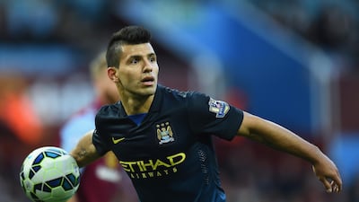
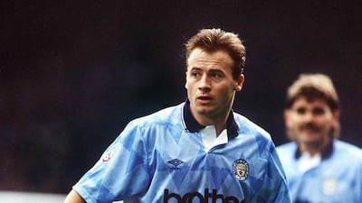
Premier League clubs are back in training after the coronavirus-enforced lockdown.
Before the season kicks back into gear on June 17, we will continue our look back on 30 years of football kits from the current 20 top-flight English clubs.
There have been some stunning works of wonder over the years ... as well as truly heinous crimes committed in the name of sporting fashion.
Next in our series is Manchester City, who are set to take on Arsenal on the restart's opening day, so take a trip down memory lane and click on the arrows or simply swipe to look at the next image.
Lexus LX700h specs
Engine: 3.4-litre twin-turbo V6 plus supplementary electric motor
Power: 464hp at 5,200rpm
Torque: 790Nm from 2,000-3,600rpm
Transmission: 10-speed auto
Fuel consumption: 11.7L/100km
On sale: Now
Price: From Dh590,000
While you're here
On Women's Day
Dr Nawal Al-Hosany: Why more women should be on the frontlines of climate action
Samar Elmnhrawy: How companies in the Middle East can catch up on gender equality
The National Editorial: Is there much to celebrate on International Women's Day 2021?
Justin Thomas: Challenge the notion that 'men are from Mars, women are from Venus'
While you're here
National Editorial: Donald Trump has left his mark on the Middle East
Con Coughlin: The thorn in the side of Biden's foreign policy team
James Reinl: Biden’s Yemen U-turn gets thumbs-up overseas
Raghida Dergham: Will Biden's 'maximum diplomacy' with Iran work?
Benefits of first-time home buyers' scheme
- Priority access to new homes from participating developers
- Discounts on sales price of off-plan units
- Flexible payment plans from developers
- Mortgages with better interest rates, faster approval times and reduced fees
- DLD registration fee can be paid through banks or credit cards at zero interest rates
Company Profile
Name: Thndr
Started: 2019
Co-founders: Ahmad Hammouda and Seif Amr
Sector: FinTech
Headquarters: Egypt
UAE base: Hub71, Abu Dhabi
Current number of staff: More than 150
Funds raised: $22 million
DUNE%3A%20PART%20TWO
Pox that threatens the Middle East's native species
Camelpox
Caused by a virus related to the one that causes human smallpox, camelpox typically causes fever, swelling of lymph nodes and skin lesions in camels aged over three, but the animal usually recovers after a month or so. Younger animals may develop a more acute form that causes internal lesions and diarrhoea, and is often fatal, especially when secondary infections result. It is found across the Middle East as well as in parts of Asia, Africa, Russia and India.
Falconpox
Falconpox can cause a variety of types of lesions, which can affect, for example, the eyelids, feet and the areas above and below the beak. It is a problem among captive falcons and is one of many types of avian pox or avipox diseases that together affect dozens of bird species across the world. Among the other forms are pigeonpox, turkeypox, starlingpox and canarypox. Avipox viruses are spread by mosquitoes and direct bird-to-bird contact.
Houbarapox
Houbarapox is, like falconpox, one of the many forms of avipox diseases. It exists in various forms, with a type that causes skin lesions being least likely to result in death. Other forms cause more severe lesions, including internal lesions, and are more likely to kill the bird, often because secondary infections develop. This summer the CVRL reported an outbreak of pox in houbaras after rains in spring led to an increase in mosquito numbers.
While you're here
The National editorial: Turkey's soft power weighs heavy on Europe's Muslims
Con Coughlin: How extremists use Zoom and other tools to exploit pandemic
Nicky Harley: Peace TV preacher Zakir Naik prompts UK hate laws review
On Women's Day
Dr Nawal Al-Hosany: Why more women should be on the frontlines of climate action
Shelina Janmohamed: Why shouldn't a spouse be compensated fairly for housework?
Samar Elmnhrawy: How companies in the Middle East can catch up on gender equality
The National Editorial: Is there much to celebrate on International Women's Day 2021?
Kareem Shaheen on Canada
On Women's Day
Dr Nawal Al-Hosany: Why more women should be on the frontlines of climate action
Shelina Janmohamed: Why shouldn't a spouse be compensated fairly for housework?
Justin Thomas: Challenge the notion that 'men are from Mars, women are from Venus'
The National Editorial: Is there much to celebrate on International Women's Day 2021?
While you're here
Joyce Karam: Chaotic first debate unlikely to swing undecideds
Hussein Ibish: Donald Trump's 3-step plan to cling to power
Sulaiman Hakemy: Make America lose again
UK-EU trade at a glance
EU fishing vessels guaranteed access to UK waters for 12 years
Co-operation on security initiatives and procurement of defence products
Youth experience scheme to work, study or volunteer in UK and EU countries
Smoother border management with use of e-gates
Cutting red tape on import and export of food
On Women's Day
Shelina Janmohamed: Why shouldn't a spouse be compensated fairly for housework?
Samar Elmnhrawy: How companies in the Middle East can catch up on gender equality
The National Editorial: Is there much to celebrate on International Women's Day 2021?
Justin Thomas: Challenge the notion that 'men are from Mars, women are from Venus'
The Great Derangement: Climate Change and the Unthinkable
Amitav Ghosh, University of Chicago Press
Duterte Harry: Fire and Fury in the Philippines
Jonathan Miller, Scribe Publications
MATCH INFO
World Cup 2022 qualifier
UAE v Indonesia, Thursday, 8pm
Venue: Al Maktoum Stadium, Dubai
SQUAD
Ali Khaseif, Fahad Al Dhanhani, Adel Al Hosani, Mohammed Al Shamsi, Bandar Al Ahbabi, Mohammed Barghash, Salem Rashid, Khalifa Al Hammadi, Shaheen Abdulrahman, Hassan Al Mahrami, Walid Abbas, Mahmoud Khamis, Yousef Jaber, Saeed Ahmed, Majed Sorour, Majed Hassan, Ali Salmeen, Abdullah Ramadan, Khalil Al Hammadi, Fabio De Lima, Khalfan Mubarak, Tahnoun Al Zaabi, Ali Saleh, Caio Canedo, Muhammed Jumah, Ali Mabkhout, Sebastian Tagliabue, Zayed Al Ameri
How Tesla’s price correction has hit fund managers
Investing in disruptive technology can be a bumpy ride, as investors in Tesla were reminded on Friday, when its stock dropped 7.5 per cent in early trading to $575.
It recovered slightly but still ended the week 15 per cent lower and is down a third from its all-time high of $883 on January 26. The electric car maker’s market cap fell from $834 billion to about $567bn in that time, a drop of an astonishing $267bn, and a blow for those who bought Tesla stock late.
The collapse also hit fund managers that have gone big on Tesla, notably the UK-based Scottish Mortgage Investment Trust and Cathie Wood’s ARK Innovation ETF.
Tesla is the top holding in both funds, making up a hefty 10 per cent of total assets under management. Both funds have fallen by a quarter in the past month.
Matt Weller, global head of market research at GAIN Capital, recently warned that Tesla founder Elon Musk had “flown a bit too close to the sun”, after getting carried away by investing $1.5bn of the company’s money in Bitcoin.
He also predicted Tesla’s sales could struggle as traditional auto manufacturers ramp up electric car production, destroying its first mover advantage.
AJ Bell’s Russ Mould warns that many investors buy tech stocks when earnings forecasts are rising, almost regardless of valuation. “When it works, it really works. But when it goes wrong, elevated valuations leave little or no downside protection.”
A Tesla correction was probably baked in after last year’s astonishing share price surge, and many investors will see this as an opportunity to load up at a reduced price.
Dramatic swings are to be expected when investing in disruptive technology, as Ms Wood at ARK makes clear.
Every week, she sends subscribers a commentary listing “stocks in our strategies that have appreciated or dropped more than 15 per cent in a day” during the week.
Her latest commentary, issued on Friday, showed seven stocks displaying extreme volatility, led by ExOne, a leader in binder jetting 3D printing technology. It jumped 24 per cent, boosted by news that fellow 3D printing specialist Stratasys had beaten fourth-quarter revenues and earnings expectations, seen as good news for the sector.
By contrast, computational drug and material discovery company Schrödinger fell 27 per cent after quarterly and full-year results showed its core software sales and drug development pipeline slowing.
Despite that setback, Ms Wood remains positive, arguing that its “medicinal chemistry platform offers a powerful and unique view into chemical space”.
In her weekly video view, she remains bullish, stating that: “We are on the right side of change, and disruptive innovation is going to deliver exponential growth trajectories for many of our companies, in fact, most of them.”
Ms Wood remains committed to Tesla as she expects global electric car sales to compound at an average annual rate of 82 per cent for the next five years.
She said these are so “enormous that some people find them unbelievable”, and argues that this scepticism, especially among institutional investors, “festers” and creates a great opportunity for ARK.
Only you can decide whether you are a believer or a festering sceptic. If it’s the former, then buckle up.
Ferrari 12Cilindri specs
Engine: naturally aspirated 6.5-liter V12
Power: 819hp
Torque: 678Nm at 7,250rpm
Price: From Dh1,700,000
Available: Now
Kareem Shaheen on Canada
The%C2%A0specs%20
More on Quran memorisation:
The specs: 2018 Genesis G70
Price, base / as tested: Dh155,000 / Dh205,000
Engine: 3.3-litre, turbocharged V6
Gearbox: Eight-speed automatic
Power: 370hp @ 6,000rpm
Torque: 510Nm @ 1,300rpm
Fuel economy, combined: 10.6L / 100km
Labour dispute
The insured employee may still file an ILOE claim even if a labour dispute is ongoing post termination, but the insurer may suspend or reject payment, until the courts resolve the dispute, especially if the reason for termination is contested. The outcome of the labour court proceedings can directly affect eligibility.
- Abdullah Ishnaneh, Partner, BSA Law
Key facilities
- Olympic-size swimming pool with a split bulkhead for multi-use configurations, including water polo and 50m/25m training lanes
- Premier League-standard football pitch
- 400m Olympic running track
- NBA-spec basketball court with auditorium
- 600-seat auditorium
- Spaces for historical and cultural exploration
- An elevated football field that doubles as a helipad
- Specialist robotics and science laboratories
- AR and VR-enabled learning centres
- Disruption Lab and Research Centre for developing entrepreneurial skills
Neighbourhood Watch
COMPANY PROFILE
More from Neighbourhood Watch:
Global state-owned investor ranking by size
|
1. |
United States |
|
2. |
China |
|
3. |
UAE |
|
4. |
Japan |
|
5 |
Norway |
|
6. |
Canada |
|
7. |
Singapore |
|
8. |
Australia |
|
9. |
Saudi Arabia |
|
10. |
South Korea |
Profile
Company: Libra Project
Based: Masdar City, ADGM, London and Delaware
Launch year: 2017
Size: A team of 12 with six employed full-time
Sector: Renewable energy
Funding: $500,000 in Series A funding from family and friends in 2018. A Series B round looking to raise $1.5m is now live.
Electric scooters: some rules to remember
- Riders must be 14-years-old or over
- Wear a protective helmet
- Park the electric scooter in designated parking lots (if any)
- Do not leave electric scooter in locations that obstruct traffic or pedestrians
- Solo riders only, no passengers allowed
- Do not drive outside designated lanes
Our commentary on Brexit
- Con Coughlin: Choice of the British people will be vindicated
- Sam Williams: Departure is influenced by its sense of place
While you're here
Johann Chacko: Why Maldives has become a theatre for US-China rivalry
C Uday Bhaskar: What is India's Indo-Pacific strategy?
C Uday Bhaskar: The 'Asian Century' depends on China and India working together
While you're here
Kareem Shaheen: Even a pandemic could not unite today's America
Michele Wucker: The difference between a black swan and a grey rhino
Robert Matthews: Has flawed science and rushed research failed us?


